Chapter 6 How does dietary diversity affect populations?
![]()
6.1 About this Workflow Demonstration
This Workflow Demonstation (WD) is primarily a supplement to the material in the book Insights from Data with R by Petchey, Beckerman, Childs, and Cooper. If you don’t understand something here, have a look at that book (perhaps again), or search for help, or get in touch with us.
At the time of publication (early 2021) there are likely some improvements that could be made to this demonstration, in terms of the description of what we do in it, why we do it, and how we do it. If anything seems odd, unclear, or sub-optimal, please don’t hesitate to get in touch, and we will quickly make improvements.
6.2 Going to the next level
This case study includes a little bit more complexity than the first one (bat diets) and covers a few new topics in R and in general. The complexity mainly occurs in the calculations we do to obtain the response variables (i.e. the variables we examine to answer our biological question). The calculations involve some conceptually challenging manipulations, and the corresponding pipelines of dplyr functions will at first seem complex and daunting.
It’s fine to be concerned, even a bit stressed, by this complexity. If you feel so, just take a break, have a chat with friends, and while doing that think about how we only travel great distances and climb high peaks by taking one small step at a time. The same applies to what seem like complex and daunting tasks in getting insights from data. It’s amazing how far we get taking one step at a time. When we show you what seems like a complex task, like a complex pipeline of functions, break it down into its component steps. Let’s take a first step by introducing the case study and data that was collected.
Again: as you work through this chapter, try following along with the workflow/checklist here.
6.3 Introduction to the study and data
The data comes from a study of how the number of available prey species for a predator consume affects the stability of the predator population dynamics. The study was designed to address the hypotheses that more pathways of energy flow to a predator (i.e. more prey species) would stabilise the predator population dynamics, 1) by increasing the abundance of the predator, 2) by reducing how much it varies, and 3) by delaying extinction.
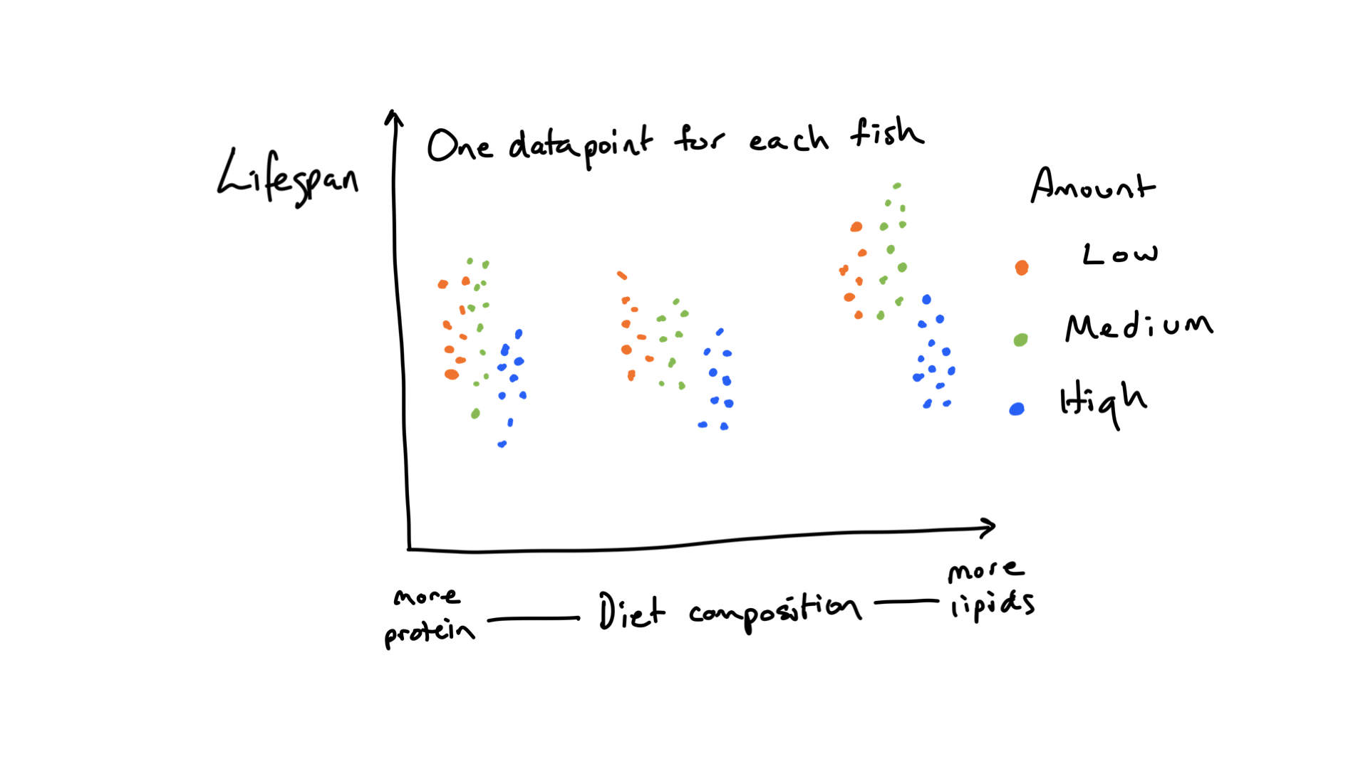
FIGURE 6.1: A hypothetical outcome of the demonstration study of how a manipulation of diet composition and amount affect the lifespan of fish.
The experiment involved three prey species and one predator. One, two or three prey species were present, with every combination of each. The experimental units were small jars of nutrient containing liquid and the predator and prey species were aquatic microbes feeding on bacteria also present in the liquid. The small size of the prey and predators (about 20 to 400 microns) means that in just a few weeks individuals can reproduce many times, and also die. There were five replicates of each of the seven prey species compositions (so 35 experimental units).
During the experiment the data was written onto paper, then at a later date the data was entered into a spreadsheet. The data in the spreadsheet was checked for errors, by comparing it with the original paper copy of the data. The data recording and entry was done with tidiness and cleanliness in mind, so tidying and cleaning will be minimal. The data file contains the data exactly as it was recorded on the paper data sheet.
Looking at the dataset in Excel or something similar, you will see the following variables:
- day - the day of the experiment the observation in the row belongs to.
- count - the number of individuals counted in the sample; used to calculate density per ml. Counts were made by eye, looking down a microscope.
- w1 - the volume of liquid in ml removed from the community for sampling abundance. Used to calculate density per ml.
- w2 - the volume of diluent added to the volume sampled, plus the volume sampled. Used to calculate density per ml.
- w3 - the volume of the sub-sample taken of the mixture of diluent and sample removed. Used to calculate density per ml.
- species - a numeric code for the species that the observation in the row belongs to.
- prey.richness - the number of prey species added to the jar.
- prey.composition - a number that identifies the combination of prey species added to the jar.
- replicate - a replicate identifier, unique within prey composition.
- jar - a number that uniquely identifies each experimental unit.
How does the data measure up to the features of data we mentioned in the first chapter?
- Number of variables. Not too many. Really there are only two or three explanatory variables, and one response variable (population size, though we will derive three separate response variables). Certainly we are not up in the range of tens of explanatory variables. And because this was an experiment, we only have variables already thought to be important.
- Number of observations. Not too many. Just 35. Our ability to detect patterns is going to be low.
- If and how many of the variables describe experimental manipulations. Yes the data are from an experiment. Prey composition was manipulated, and so therefore was prey richness. So we know that any apparent relationships between the predator population and the prey composition is a result of a causative relationships. I.e. if we alter prey composition and only prey composition (as is the case here) and see changes in the predator population then we know that prey composition caused those changes.
- The amount of correlation among the variables. There is no correlation to speak of; this is not so uncommon in an experiment.
- How independent are the observations. Here we need to be a bit careful. There were 35 experimental units, so there should be 35 data points in our analyses. Multiple samples through time were taken from each experimental unit, however—we have repeated measures. We will take care of this, and not fall into a trap of trying to interpret patterns in graphs with lots of non-independent data points.
6.4 What type of response variable?
This question is worth asking at the beginning of a study. There were, in fact, three main response variables used in this study and these correspond to the three hypotheses mentioned above. I.e. there is one response variable for each of the three hypotheses/questions. These response variables were: 1) the population size of the predator population, 2) the temporal variability of the predator population size, and 3) the amount of time for which the predator population persisted. Each of these is an component/influence on the stability of the predator population. Each will have to be calculated from the time series of predator population density (number of individuals predators per ml) in each replicate. First though we will have to calculate population density from count, w1, w2, and w3, because during the experiment the volume of liquid in which the number of individuals of each species was counted varied (i.e. w1, w2, and w3 are not constant). The reason for this variation is that dilution is required when populations are very dense, otherwise the dense swarm of individuals would be near impossible to count. But first…
6.5 A little preparation
Make a new folder for this case study, and in it a folder called data (this will contain any datasets for this case study/project). In RStudio create an RStudio project and save it in the project folder (not the data folder). Close RStudio and double click on the project file to re-open RStudio. Create a new R script file and load the libraries we will use:
# Load the libraries we use
library(dplyr)
library(ggplot2)
library(readr)
library(stringr)
library(lubridate)
library(tidyr)
library(forcats)
Install the forcats library if you have not already done so, otherwise library(forcats) will not work. Look at the Packages section of the Getting Acquainted chapter if you need help with installation.
6.6 Acquire the dataset
Get the data file dileptus expt data.csv from the dryad repository associated with the publication about the data (make sure you get version 2 of the dataset). The dataset is stored on dryad in comma separated value (csv) format. Put the file in your data folder for this project.
6.7 Import the dataset
Import the dataset using the read_csv() function from the readr package.
Make sure you opened RStudio by clicking on your project file for this case study (or switch to the RProject in the top right of the RStudio window. This will ensure RStudio is looking at the correct folder, and that the relative path used before the file name will be correct:
stab <- read_csv("data/dileptus_predator_prey_data.csv")##
## ── Column specification ───────────────────────────────
## cols(
## day = col_double(),
## count = col_character(),
## w1 = col_double(),
## w2 = col_double(),
## w3 = col_double(),
## species = col_double(),
## prey.richness = col_double(),
## prey.composition = col_double(),
## replicate = col_double(),
## jar = col_double()
## )Great, we didn’t get an error. The read_csv() function has done two things. It read in the data and the stab <- assigns the data to a new object called stab (you could give it a name other than stab if you wish).
The read_csv() function also gives a summary of what it found.
6.8 Checking the import worked correctly
Now we should check some basic things about the imported data. Let’s start by checking if it has the correct number of rows and variables, and if variables are the expected (i.e. correct type). We can look at these features of the imported data in many ways. One useful method is to type the name of the data object in the Console and press enter:
stab## # A tibble: 806 x 10
## day count w1 w2 w3 species prey.richness
## <dbl> <chr> <dbl> <dbl> <dbl> <dbl> <dbl>
## 1 2 52 0.356 6.32 0.322 1 1
## 2 2 0 0.356 1 1 4 1
## 3 2 66 0.360 6.56 0.323 1 1
## 4 2 0 0.360 1 1 4 1
## 5 2 21 0.303 5.67 0.0843 2 1
## # … with 801 more rows, and 3 more variables:
## # prey.composition <dbl>, replicate <dbl>, jar <dbl>We are told the object is A tibble: 806 x 10. This is what we expect if we look at the datafile. All looks good so far then.
Not all is well, however, as some of the variables that should be numeric are character, and vice versa. We expect count to be numeric. Looking that the count variable we see some entries are a full stop. This is because the dataset was originally made to be used by software (SAS) which by default uses the full stop to indicate a missing value. So we need to repeat the import the a full stop as the missing value indicator:
stab <- read_csv("data/dileptus_predator_prey_data.csv", na = ".")##
## ── Column specification ───────────────────────────────
## cols(
## day = col_double(),
## count = col_double(),
## w1 = col_double(),
## w2 = col_double(),
## w3 = col_double(),
## species = col_double(),
## prey.richness = col_double(),
## prey.composition = col_double(),
## replicate = col_double(),
## jar = col_double()
## )Good, now count is a numeric type variable.
6.9 Cleaning and tidying
6.9.1 Recode some names
We expect the species and the prey.composition variables should probably be character variables. Indeed, they really should be characters, but they appear to be integers. Always use the proper word when you have one —don’t ever use codes like this (the person who entered this data was probably not thinking about this carefully enough! Or was constrained by time. Or both.). Let’s fix this by replacing the species code numbers with their names (we found the correct names for each code in the lab book for this experiment; they are not in the dataset):
stab <- stab %>%
  mutate(species = recode(species,
                          "1" = "Colpidium",
                          "2" = "Collodictyon",
                          "3" = "Paramecium",
                          "4" = "Dileptus"))
Here we do a mutate to make a new version of the species variable, and the recode function to change the numbers to the species names. We first give recode the variable to work on (species) and then tell it to change each 1 to “Colpidium” and so on for the other numbers.
Next we work on the prey.composition variable. In fact, we’re just going to throw it away as it is redundant, because we can construct it from the species variable. Let’s do that. While we’re at it, let’s also get the prey richness from the other columns, rather than use the existing imported prey.richness column.
The first thing we’ll do is make a new dataset containing these two new variables, community_composition and prey_richness, and we’ll get these variables for each prey composition and replicate combination:
comm_comp <- stab %>%
  group_by(prey.composition, replicate) %>%
  summarise(community_composition = paste(unique(species), collapse = ", "),
            prey_richness = length(unique(species)) - 1)
## `summarise()` has grouped output by 'prey.composition'. You can override using the `.groups` argument.Let’s break this down. We’re doing a group_by—summarise. The group_by is by prey.composition (seven compositions) and replicate (five replicates), so we’re expecting 7 * 5 = 35 rows in this new dataset. Then in the summarise we create in the first line the new community_composition variable, and in the second the new prey_richness variable. To make the new community_composition variable we paste together the species present in the group (composition by replicate combination); we use unique to remove repeats of the species names, and collapse to make the species names in a group be pasted together into one string. Take a look at the new community_composition variable, and then look again at the code above and the description of how we just made this new prey_composition variable.
comm_comp %>%
  select(community_composition)
## Adding missing grouping variables: `prey.composition`## # A tibble: 35 x 2
## prey.composition community_composition
## <dbl> <chr>
## 1 1 Colpidium, Dileptus
## 2 1 Colpidium, Dileptus
## 3 1 Colpidium, Dileptus
## 4 1 Colpidium, Dileptus
## 5 1 Colpidium, Dileptus
## # … with 30 more rowsWe also make the new prey_richness variable. The code was prey_richness = length(unique(species)) - 1. The length function tells us the number of unique (because we used the unique function) species, and we subtract the 1 to remove the 1 added by the predator species being present.
Next we do more or less the same thing to get a new variable prey_composition. This will be the same as the community composition variable we just made, but without the predator species name included. The code is more or less the same, but with the predator (Dileptus) rows filtered out before the summarise.
prey_comp <- stab %>%
  group_by(prey.composition, replicate) %>%
  filter(species != "Dileptus") %>%
  summarise(prey_composition = paste(unique(species), collapse = ", "))
## `summarise()` has grouped output by 'prey.composition'. You can override using the `.groups` argument.The final thing to do is to add the new variables to the original dataset. We do this by merging (joining) the datasets with the new variables into the original dataset, one then the other, then we clean a bit by removing the old prey.composition and prey.richness variables, and by removing the comm_comp and prey_comp datasets which were only of temporary use.
stab <- full_join(stab, comm_comp) %>%
  full_join(prey_comp) %>%
  select(-prey.composition, -prey.richness) %>%
  ungroup()
## Joining, by = c("prey.composition", "replicate")
## Joining, by = c("prey.composition", "replicate")rm(comm_comp, prey_comp)It’s not necessary to remove variables and datasets that we’re not interested in using anymore, but is often a good idea to do so. It can prevent us accidentally using them, or just from getting confused about what they are and if they are in fact important when we come back to our work after a gap of a few months, as often happens. If we have a rather large dataset, keeping only the essential variables can usefully reduce the size of the dataset.
6.9.2 Make the prey_composition variable a factor with specific order
What on earth did that section title mean? So far we have not mentioned factors. These are a type of variable that contains words (a bit like character variables) but in which the different words/categories are referred to as levels and have an explicit order. This order affects how some things are done in R, and this is why we want to determine the specific order of the levels of the prey_composition variable. For example, when we make a graph with prey_composition on the x axis we would like the three single-species prey compositions first on the left, then the three two-species prey compositions, then the three-species prey composition on the right.
Before we do this, look at the prey_composition variable in its current state:
stab %>%
  select(prey_composition)
## # A tibble: 806 x 1
## prey_composition
## <chr>
## 1 Colpidium
## 2 Colpidium
## 3 Colpidium
## 4 Colpidium
## 5 Collodictyon
## # … with 801 more rowsIt is a character variable (<chr>). If we try to see what the levels of this variable are, we get NULL; there are no levels:
stab %>%
  pull(prey_composition) %>%
  levels()
## NULLTo change this to an ordered factor type variable, we use the fct_relevel function from the forcats package inside a mutate change the prey_composition variable:
stab <- stab %>%
  mutate(prey_composition =
           fct_relevel(prey_composition,
                       "Collodictyon",
                       "Colpidium",
                       "Paramecium",
                       "Colpidium, Collodictyon",
                       "Colpidium, Paramecium",
                       "Collodictyon, Paramecium",
                       "Colpidium, Collodictyon, Paramecium")
  )
Now let’s see how the prey_composition variable looks:
stab %>%
  pull(prey_composition) %>%
  levels()
## [1] "Collodictyon"
## [2] "Colpidium"
## [3] "Paramecium"
## [4] "Colpidium, Collodictyon"
## [5] "Colpidium, Paramecium"
## [6] "Collodictyon, Paramecium"
## [7] "Colpidium, Collodictyon, Paramecium"Excellent. The variable is now a factor (<fct>) and we can see its levels.
Do not worry if it’s not immediately apparent why we made this variable an ordered factor—we emphasise the point a couple of times below where the benefits of this are very clear.
6.9.3 Fix those variable names
We don’t have any spaces, brackets, or other special characters in variable names, and there is no date variable we need to correctly format. Great – the person who entered the data did something right!
6.9.4 Calculate an important variable
When we first introduced the data, we identified four variables that would be used to calculate the number of individual organisms per ml. We must do this because different volumes and dilutions of liquid were counted at different times in the experiment. Standardising the abundance measures to number of individuals per ml will also allow interoperability with data from other studies that have also been standardised.
Look at the definitions of the four variables count, w1, w2, and w3 and see if you can figure out how to convert the count to per ml. It’s not easy, but not too difficult perhaps. Really, give it a go. The challenge of getting insights from data is in large part about being able to solve problems like these. After solving them on paper we can then move to R to implement the solution.
Start by simplifying the problem. Imagine we made no dilution of w1 such that w2 = w1 and counted all of w1 such that w3 = w1. In effect we just took the volume w1 from the experimental culture and counted the number of individuals in it. If w1 is 1 ml, then then the number of individuals counted (in variable count) is per ml. If w1 is 0.5ml, we need to multiple the count by 2 (i.e. divide by 0.5) to get to per ml. If w1 is 2 ml we need to divide by 2 to get to per ml. In this case we could use the formula count / w1 to convert to number of individuals per ml.
Now think about if we sampled 1 ml (w1 = 1 ml), added 1 ml of diluent (w2 = 2 ml), and then counted 1 ml of that diluted sample (w3 = 1). We have diluted by a factor of 2 (w2 / w1 = 2) and counted 1 ml of that dilution, so we need to multiply the count by 2 to get to per ml. That is, we multiply the count by the dilution factor to get the count per ml (so long as w3 = 1 ml).
Finally, think about if we count only 0.1 ml of the diluted sample (w3 = 0.1 ml). That is a tenth of a ml, so we need to multiply by ten (or divide by 0.1). That is, we divide by w3 to correct to count per ml when w3 is not 1 ml.
Putting these parts together we see that we multiply by the dilution factor w2/w1 and then divide by the volume counted (w3). We, of course, add the new dens_per_ml variable and calculation using the mutate function:
stab <- stab %>%
  mutate(dens_per_ml = count * w2 / w1 / w3)
Super-simple! Now we have a standardised, comparable, and interoperable measurement of population size of each species.
Actually, the data entry was done so to make this calculation work very easily. In particular, w2 is very purposefully the sum of the sampled volume and the diluent, and is not just the volume of the diluent. Furthermore, if there was no dilution, and the count was made of w1 we might have entered NA for w2 and w3 since they did not exist. Instead, the both w2 and w3 are set to 1 in this case, which means they have no effect in the calculation (multiplication and division by 1 has no effect). This is an example of designing and planning before and during data entry with downstream calculations in mind.
6.9.5 Remove NAs
When we imported the data we noticed some values of count were missing (NA). The reason these particular counts are NA while there are still values of w1, w2, and w3 is a bit of a puzzle. One might imagine that the NA should really be a zero. In fact, what the researcher did was to sometimes enter NA after a species had become apparently extinct, because after not seeing individuals of a species for several days there was no attempt to observe that species, even though a sample was taken to observe any other still extant species in that community. So these NA values are when a species has gone extinct, and so could be zero, but since no count was attempted, it was appropriate to enter missing value NA. A consequence of all that is that we can remove all observations/rows containing an NA.
We can do this with a filter so that we remove only rows with an NA in the count variable:
temp1 <- stab %>%
  filter(!is.na(count))
nrow(temp1)
## [1] 680Or remove we can remove rows with and NA in any of the variables:
temp2 <- stab %>%
  na.omit()
nrow(temp2)
## [1] 680Since the number of remaining rows is the same for both approaches we know there we no observations in which a variable other than count contained an NA when the count variable did not. So we’re safe doing it either way. Let’s overwrite stab with a new version with no NA values.
stab <- stab %>%
  na.omit()
6.9.6 Checking some specifics
We should check some feature of the dataset specific to the study.
Which days were samples taken on? To find this we pull the day variable from the tibble stab and get its unique values:
stab %>%
  pull(day) %>%
  unique()
## [1] 2 4 6 8 10 12 14 16 18 20Samples were taken every two days from day two until a maximum of day 20. So we expect a maximum number of counts of species abundances in a particular replicate to be 10 multiplied by the number of species in a replicate community. I.e. the maximum number of counts in a community with two prey species and the predator (recall that all communities contained the predator) will be 30. Maximum number of counts will be 20 for communities with only one prey species. Note that this is the maximum because we know some values of count were NA.
Let’s now get the number of counts for each replicate community, and while we’re at it, the last day sampled for each replicate. We do this with a group_by %>% summarise pipeline, grouping by the jar and prey_composition variables. We include the prey_composition variable in the grouping so that we have it to refer to in the resulting summary dataset, and place it first in the group_by function so that the summary dataset is arranged by this variable.
temp1 <-stab %>%
  group_by(prey_composition, jar) %>%
  summarise(num_samples = n(),
            max_day = max(day))
## `summarise()` has grouped output by 'prey_composition'. You can override using the `.groups` argument.temp1## # A tibble: 35 x 4
## prey_composition jar num_samples max_day
## <fct> <dbl> <int> <dbl>
## 1 Collodictyon 3 11 12
## 2 Collodictyon 4 11 12
## 3 Collodictyon 18 14 14
## 4 Collodictyon 19 14 14
## 5 Collodictyon 20 4 4
## # … with 30 more rows
Notice how the dataset is arranged in the same order as the levels of the prey_composition variable that we specified when we made this variable an ordered factor type variable. The order is as we planned. If we had not made the prey_composition variable into an ordered factor, R would have chosen its preferred arrangement/ordering, and often this is not our preference. You can see R’s preferred arrangement if you replace prey_composition with as.character(prey_composition) in the group_by.
Looking at the summary tibble temp1 (remember you can use View(temp1) or click on temp1 in the Environment tab) we see that each of the prey compositions has five replicates, exactly as expected. And, also as expected, the maximum number of samples is 10 times the number of species, though often this maximum was not realised. We also see that some communities were sampled for longer than others (we assume this is due to sampling ceasing when all species went extinct).
We can have R confirm the number of replicates per prey composition with a quick group_by %>% summarise pipeline working on temp1:
temp1 %>%
  group_by(prey_composition) %>%
  summarise(number_of_replicate = n())
## # A tibble: 7 x 2
## prey_composition number_of_replicate
## <fct> <int>
## 1 Collodictyon 5
## 2 Colpidium 5
## 3 Paramecium 5
## 4 Colpidium, Collodictyon 5
## 5 Colpidium, Paramecium 5
## # … with 2 more rowsWe can also get the number of counts made of each species by using the same code with species added as a grouping variable:
temp2 <- stab %>%
  group_by(prey_composition, jar, species) %>%
  summarise(num_samples = n(),
            max_day = max(day))
## `summarise()` has grouped output by 'prey_composition', 'jar'. You can override using the `.groups` argument.temp2## # A tibble: 95 x 5
## prey_composition jar species num_samples max_day
## <fct> <dbl> <chr> <int> <dbl>
## 1 Collodictyon 3 Collodict… 5 10
## 2 Collodictyon 3 Dileptus 6 12
## 3 Collodictyon 4 Collodict… 5 10
## 4 Collodictyon 4 Dileptus 6 12
## 5 Collodictyon 18 Collodict… 7 14
## # … with 90 more rowsHere we see that two of the microcosms had only two samples taken. These are the ones in which the last day sampled was day four (confirm this for yourself if you wish; View(temp2) is useful for this).
All this might seem like overkill, particularly if we imagine that we had collected and entered the data into the spreadsheet. Surely then we would know all this, and therefore not have to check it? It’s not overkill, however. It’s about making efforts to ensure that we and R are in perfect agreement about the nature and contents of the data. Reaching such agreement is absolutely essential, and often involves resolving differences of opinion by highlighting hidden (and potentially dangerous) assumptions made by us and/or by R about the nature and contents of the data. By taking such efforts we are investing in the foundations of our insights. We need solid foundations for reliable, robust, and accurate insights.
6.9.7 A closer look at the data
We so far have not looked at the species abundances and have not yet calculated the three required response variables. Let’s begin by looking at the species abundances, and do this by plotting the dynamics of the species in each microcosm. Now you will begin to see the power, elegance, and amazingness of ggplot. We will map the log 10 transformed abundance data onto the y-axis. We will map the day variable onto the x-axis. We will plot the data as points and lines (so use geom_line and geom_point) and we will map the species variable onto the colour of the points and lines. And we will make a grid of facets using facet_grid with rows of the grid corresponding to prey composition and columns for the replicates. Translating that into ggplot terms we get the following code (producing Figure 6.2):
stab %>%
  ggplot(aes(x = day, y = log10(dens_per_ml), col = species)) +
  geom_point() +
  geom_line() +
  facet_grid(prey_composition ~ replicate)
FIGURE 6.2: Population dynamics observed during the experiment.
Notice that we gave the aesthetic mappings as an argument to the ggplot function (we have mostly been giving the aesthetic mappings to the geoms). We give the mappings to ggplot here because we have two geoms… and we would like both to use the same mappings. And because we don’t give them any mappings, they are inherited from the mappings giving to ggplot. This "inheritance is explained and illustrated in more detail in the book.
Notice the order of the rows of facets in the graph—it is from top to bottom the order we specified when we made the prey_composition variable an ordered factor. So ggplot is using this order. If you like to see what the order would have been if we hadn’t specified it, replace prey_composition with as.character(prey_composition).
The dynamics in Figure 6.2 are those shown in figure 1 of the original publication. Everything seems reasonable, though I (Owen) wish I’d recorded more information about why I stopped sampling the microcosms when I did.
The predator (Dileptus) does not seem to grow well when Collodictyon is the only available prey species, but grows very well on and decimates Colpidium, after which the predator appears to go extinct and then the Colpidium population recovers. We can also notice that the predator population persists to the end of the experiment on day 20 only when all three prey species are present. It is probably worth emphasising that 20 days corresponds to around 20 generations of these organisms; this is a lot of time for birth and death to affect population abundances (if each individual divided into two daughters each day, the population would increase in size by a factor of 2^20, i.e. grow to be 1 million times larger).
6.9.8 Calculate the three response variables
There are three response variables corresponding to the three hypotheses about why increased prey diversity might increase predator population stability:
- Predator population abundance.
- Predator population variability.
- Predator population persistence time.
6.9.8.1 Calculating predator (Dileptus) abundance
You might be thinking “we already have predator abundance,” and you’d be correct. We have estimates of the number per ml on each of the sample days. The issue that we now have to deal with, and solve somehow, is that of independence of observations. When we take repeated measures of the same thing, here the same predator population in the same experimental community, the repeated measures are not independent, and measures closer together in time are less independent than are those further apart in time. There are some rather complex and perhaps sophisticated ways of accounting for the non-independence in repeated measures, but they are beyond the scope of what we want to cover. Instead we are going to use a rather crude, but also quite valid solution. That is to use the maximum predator abundance in each of the experimental unit (communities). There are 35 experimental communities, so we expect to have 35 estimates of average predator abundance.
To make the calculation in R we will use a filter %>% group_by %>% summarise pipeline. We filter to keep only the observations of the predator (Dileptus), then group the data by prey_richness, prey_composition, and replicate, then calculate two summary values. The first summary value, named by us pred_max_dens is the maximum density of the predator population observed in each experimental community. The second variable calculated, named by us all_zero is TRUE if all the predator densities were zero, or is otherwise FALSE. Here is the R code:
pred_max_dens <- stab %>%
  filter(species == "Dileptus") %>%
  group_by(prey_richness, prey_composition, replicate) %>%
  summarise(max_dens = max(dens_per_ml),
            all_zero = sum(dens_per_ml > 0) == 0)
## `summarise()` has grouped output by 'prey_richness', 'prey_composition'. You can override using the `.groups` argument.As expected, the resulting tibble contains 35 observations and four variables. Lovely. We will look at the values after we calculate the other two response variables.
In the group_by we included a redundant grouping variable prey_richness. It is redundant in the sense that we would have got the same resulting tibble if we had not included it, the only difference being that the resulting tibble would not have contained the prey_richness variable. We will often find ourselves including redundant variables in a group_by because we would like to them to appear in the resulting tibble so we can use them later.
We calculated the maximum of the predator abundance, but could have chosen the mean, median, or the geometric mean, or harmonic mean. It is really important to recognise that the choice of mean here is quite arbitrary, and so introduces an element of subjectivity into our journey from data to insights. Such subjectivity is a rather common feature of this journey.
We must make sure our insights are robust to subjective decisions about how to reach them. We can do this by looking at whether the insights are sensitive to changes in these decisions. This is quite different, however, from selecting the decision that gives a result we might desire, which would clearly be a totally inappropriate practice.
6.9.8.2 Calculating predator (Dileptus) population variability
We will use the coefficient of variation as the measure of predator population variable. The coefficient of variation, or CV for short, is the standard deviation of the abundances divided by the mean of the abundances. What values might we expect? Well, one thing to expect is some undefined values, since we know that in six of the communities there were no predators observed. The mean will therefore be zero, and the result of division by zero is undefined. So we expect the CV to be NaN for the six communities in which the predator was never observed.
The R code is very similar to that used in the previous section to calculate maximum predator abundance:
pred_CV <- stab %>%
  filter(species == "Dileptus") %>%
  group_by(prey_richness, prey_composition, replicate) %>%
  summarise(CV = sd(dens_per_ml) / mean(dens_per_ml),
            all_zero = sum(dens_per_ml > 0) == 0)
## `summarise()` has grouped output by 'prey_richness', 'prey_composition'. You can override using the `.groups` argument.Looking at the data (e.g. with View(pred_CV) shows us that indeed there are six NaN values of CV. We will look at the other CV values after we calculate the third response variable.
Congratulations if you noticed that we could have calculated maximum abundance and CV of abundance in the same summarise. This would have been more efficient, in the sense that we would have had less code. It would also have been safer since then we could not have accidentally done something different (e.g. a different grouping) for the two.
6.9.8.3 Calculating predator (Dileptus) persistence time
Before we do, what type of variable is this? One characteristic is that it is “time to event” data… we are observing the amount of time taken for a particular event (here extinction) to occur. The values can’t be negative. They could be continuous, but in this case are not, because we sampled only every other day. Hence the variable is discrete numbers. We will go into a bit more detail about this nature of values of persistence time after we calculate them.
We get the last day on which Dileptus was observed with a filter %>% group_by %>% summarise pipeline. We filter to retain only observations of Dileptus being present (i.e. we exclude observations when Dileptus had zero count/density per ml). Then we group the data by prey richness, prey composition, and replicate (prey richness is redundant but we want to keep it to work with later). Then we use summarise to get the maximum value of the day variable in the filtered data. Translated into R this looks like:
temp_persistence_time <- stab %>%
  filter(species == "Dileptus", dens_per_ml != 0) %>%
  group_by(prey_richness, prey_composition, replicate) %>%
  summarise(last_day_observed = max(day))
## `summarise()` has grouped output by 'prey_richness', 'prey_composition'. You can override using the `.groups` argument.Note that the created tibble has only 29 observations, whereas there were 35 experimental communities. This difference occurs because Dileptus was never observed in six of the experimental communities and so these are filtered out of this analysis. We will add them in below as a side effect of another manipulation, so don’t need to take care of this further here.
Next we need to recognise that the last day on which Dileptus was observed might have been the last day observed because it was after that observed to be extinct, or that it was never sampled again (e.g. if the last day observed was day 20). If we stop an experiment before we observe the event being watched for (e.g. before we observe extinction) then we say that the observation is censored.
We really should include this information in the persistence time dataset. To do so we need to get and add the day of last sample of Dileptus. We do this with the same pipeline as we used to get the last day observed, except we don’t exclude the observations when Dileptus was sampled and found to have zero abundance:
pred_last_day <- stab %>%
  filter(species=="Dileptus") %>%
  group_by(prey_richness, prey_composition, replicate) %>%
  summarise(last_sample=max(day))
## `summarise()` has grouped output by 'prey_richness', 'prey_composition'. You can override using the `.groups` argument.The created tibble has the expected number of observations: 35.
We then join the two created tibbles and create a new variable that contains TRUE if the observation of persistence time was censored (indicated if the persistence time is the same as the last day sampled) or FALSE if a sample was taken after the observed persistence time (i.e. the observation is not censored).
pred_persistence_time <- temp_persistence_time %>%
  full_join(pred_last_day) %>%
  mutate(censored=ifelse(last_day_observed==last_sample, T, F))
## Joining, by = c("prey_richness", "prey_composition", "replicate")Because we used full_join we have 35 observations in the resulting tibble, with six NA values of persistence time (and also therefore censored) corresponding to the six communities that are missing from the persistence_time tibble because Dileptus was never observed in those communities.
Censored observations in time to event data Often we do not have the exact time at which the event of interest occurred. In this experiment we sampled only one every two days. If we observed some individuals on day 14, for example, and then none on or after day 16, we know that extinction occurred somewhere in the time interval between day 14 and day 16. Thus we have what is called “interval censored” time to event data. That is, unless extinction was not observed by the last sample, in which case the data are right censored, and we can only say that extinction (since it is at some point inevitable) will happen sometime after the day of the last sample. Censoring of time to event data is very common and is formally accounted for in statistical analyses of time to event type data. It certainly complicates and adds potential for misinterpreting visualisation of the data, so we must then at least differentiate data points by the type of censoring they have.
6.9.8.4 Put them all together
Let’s put all three response variables into the same tibble, since it will make some of the subsequent things easier and more efficient. We want them all in the same column. “But wait,” you say! If all three response variables are in the same column/variable, how will we know which is which. Easy—we make another variable that tells us the response variable in each row. The new tibble will have 35 * 3 = 105 rows. There are lots of ways to do this. The approach we show is to merge/join the three tibbles containing each of the response variables (pred_max_dens, pred_CV, and pred_persistence_time) which creates a wide-formatted arrangement of the data (a different variable for each of the response variables). And then we’ll transform it into tidy (long) format by gather the information from each of the three separate response variables into one variable.
The first step is to merge all three tibbles:
wider_rv <- pred_max_dens %>%
  full_join(pred_CV) %>%
  full_join(pred_persistence_time)
## Joining, by = c("prey_richness", "prey_composition", "replicate", "all_zero")## Joining, by = c("prey_richness", "prey_composition", "replicate")We get told both joins are being done by prey_richness, prey_composition, and replicate and also all_zero for the first of the two joins. Lovely—thanks very much. (The join is done by these because R looks for variables shared by the two tibbles being joined, and by default joins by these.)
Next step is to gather the three response variables into one variable:
rv <- wider_rv %>%
  pivot_longer(names_to = "Response_type",
               values_to = "Value",
               cols = c(max_dens, CV, last_day_observed))
We tell pivot_longer that we’d like the values in the variables max_dens, CV, and last_day_observed gathered together an put into one variable called Values and that we’d like the key variable, i.e. the one that says which response variable each observation is about, to be named Response_type. If how pivot_longer works is unclear then please refer to the section of the book that covers this.
Excellent. We now have a tibble rv with 105 observations (as expected), a variable named Response_type with entries max_dens, CV, and last_day_observed, and the values of each of these in the Value variable. We have the other variables all_zero, last_sample, and censored also (which is just fine).
6.10 Shapes
Let’s get the mean, standard deviation, and number of observations of each of the response variables for each prey composition. You have seen how to do this before. Take a look back through the book/your notes/your brain to remind yourself.
Yes… it’s a pretty straightforward group_by %>% summarise pipeline:
summry_rv <- rv %>%
  group_by(prey_richness, prey_composition, Response_type) %>%
  summarise(mean = mean(Value, na.rm = TRUE),
            sd = sd(Value, na.rm = TRUE),
            n = sum(!is.na(Value)))
## `summarise()` has grouped output by 'prey_richness', 'prey_composition'. You can override using the `.groups` argument.The resulting tibble summry_rv has 21 observations (7 prey compositions by 3 response variables) and six variables, three of which are the calculated mean, standard deviation, and number of non-NA values.
We counted the number of non-NA values by asking which of the entries in Value were not NA using !is.na, which gives a series of TRUE and FALSE values. Then we use sum to count the number of TRUEs.
Take a look at the resulting tibble (View(summry_rv)). Can you see any patterns? Do you get clear insights? Probably not. The lesson here is tables are quite difficult to interpret. We need some visualisations of relationships between the response variables differ and the treatments. Before we do this, let’s have a look at the distributions of the response variables. Try to think about how you would produce graphs of the frequency distributions of each of the response variables.
Here is how we did it (producing Figure 6.3):
rv %>%
  ggplot() +
  geom_histogram(aes(x = Value), bins = 5) +
  facet_wrap(~ Response_type, scales = "free")
## Warning: Removed 12 rows containing non-finite values
## (stat_bin).
FIGURE 6.3: Histograms of the three response variables.
First note that we are told that 12 non-finite values have been removed and therefore are not in the visualisation. These are the CV and last_day_observed for the six communities were no predators were ever observed.
What do you think about the shapes of these distributions? Maximum density looks quite skewed, with lots of small values and few large. This might be expected for an abundance type variable, since growth is a multiplicative process. We would expect a more symmetric distribution of logged abundance (though see Figure 6.4).
## Warning: Removed 6 rows containing non-finite values
## (stat_bin).
FIGURE 6.4: Histogram of log10 maximum abundance. We thought that log transformation would make the distribution more symmetric, but it has not… it just made it asymmetric in the opposite direction!
There are two reasons why we need to be cautious, however, about interpreting much about these distributions. First, they each contain data from seven different treatments (prey_composition)—only five of the values in each distribution might be expected to come from the same population. In effect, we might be looking at seven distributions superimposed on top of each other. Second, sure, we could plot a separate distribution for each of the prey compositions, but we would only have five values per distribution, and that is not enough to say much about their shapes. I.e. we could not say with any confidence if they are symmetric of not. All is not lost, however, as you will see in the next section in which we look at relationships.
6.11 Relationships
Recall the question we’re interested in. Do predators have more stable populations when they have more prey to feed on. We expected this to be so if maximum predator population was greater, if predator population variability was lower, and if predator population persistence was longer when there were more prey available. For each of these we must look at the relationship between the response variable and prey richness (the explanatory variable). We can also look at prey composition as an explanatory variable, to see if there is much difference between effects of prey communities with same number of prey species, but different compositions of prey species.
6.11.1 Maximum predator density
Recall that we have one tibble rv with all three response variables. Clearly then, if we want to plot data about only maximum prey density we will need to filter the data according to Response_type == "max_dens. We then do a pretty straightforward ggplot with prey_richness mapped onto the x-axis, the Value of maximum density mapped onto the y-axis, and then a geom_jitter with jitter only along the x-axis (width). Here’s the code, and the result is in Figure 6.5:

FIGURE 6.5: A not so useful graph due to the y-axis label being totally uninformative. Value of what?
There is a big problem with this. Our figure does not tell us what is on the y-axis (“Value” is not particularly informative!) We could fix this by changing the y-axis like this (no figure is presented for this code):
rv %>%
  filter(Response_type == "max_dens") %>%
  ggplot() +
  geom_jitter(aes(x = prey_richness, y = Value, col = prey_composition),
              width = 0.1, height = 0) +
  ylab("max_dens")
This is a bit dangerous, in fact, because we have to make sure we have max_dens written in two places. If we accidentally to write max_dens in the filter and CV in the ylab we will get no warning, no error, and have no idea we did anything wrong. We should spot the error if we carefully compare the graphs among the three different response variables, as there should be some inconsistencies (e.g. exactly the same data plotted in two, or two with different data but the same ylab).
Let’s do the graph so we making this error is impossible. First we define an object (we name it rv_oi which is an abbreviation of “response variable of interest”) and assign to it the name of the response variable we want to graph (max_dens in this case):
rv_oi <- "max_dens"Then we use the same ggplot code as before, but with rv_oi in place of "max_dens" (the resulting graph is in Figure 6.6):
rv %>%
  filter(Response_type == rv_oi) %>%
  ggplot() +
  geom_jitter(aes(x = prey_richness, y = Value, col = prey_composition),
              width = 0.1, height = 0) +
  ylab(rv_oi)
FIGURE 6.6: A reasonably nice graph of maximum predator density in a community against the number of prey available to the predator.
Super. We have a safe approach and a useful graph. Do you think there is strong evidence of higher maximum predator abundance at higher prey richness? Neither do we. Strike one.
Plot the data points Note that we are plotting the data points, and not bars with error bars, or even box-and-whisker plots. There are few enough data points in this study that we experience no problems when we plot the data itself, rather than some summary of the data (e.g. the mean plus and minus the standard deviation). As a rule, always plot the data.
If we feel that we can’t so easily see the differences among prey compositions within the prey richness levels, we can make Figure 6.7, and flip the x and y-axis since the prey composition names then fit better:

FIGURE 6.7: This time maximum predator density plotted against prey composition, with prey composition on the y-axis as an easy method for having the tick-labels (prey composition) not overlap.
Some things are a bit clearer. 1) The predator seems to like the prey Colpidium when alone more than either of the other two when alone. 2) Adding Paramecium into a mix with Colpidium gets rid of the beneficial nature of Colpidium (i.e. these two act non-additively). 3) There is huge variation in predator abundance when feeding on a mixture of Colpdium and Collodictyon. Overall, there are strong effects of prey composition, and they sometimes involve non-additive effects, but little evidence of increases in predator abundance with increases in prey richness. Let’s move on to the next response variable.
6.11.2 Predator population variability (CV)
Making the graphs for CV is now a doddle. We just set rv_oi = "CV and then run exactly the same code as before, resulting in Figure 6.8:
rv_oi <- "CV"
rv %>% filter(Response_type == rv_oi) %>%
  ggplot() +
  geom_jitter(aes(x = prey_richness, y = Value, col = prey_composition),
              width = 0.1, height = 0) +
  ylab(rv_oi)
## Warning: Removed 6 rows containing missing values
## (geom_point).
FIGURE 6.8: A quite informative graph of predator population variability (measured as the coefficient of variation–CV) in a community against the number of prey available to the predator.
And Figure 6.9:
## Warning: Removed 6 rows containing missing values
## (geom_point).
FIGURE 6.9: Predator population variability (CV) for each of the prey compositions. It would be nice to know from which jar the very low value for one of the Collodictyon replicate comes. We show how to do that next.
What do you think? Would you be confident stating that there was a negative relationship here, such that increases in prey richness cause decreases in predator population variability? Put another way, how much would you bet that in reality there is an effect? One problem here is that we have rather few data points, and quite a bit of variability even within prey compositions. Indeed, the amount of variability in the CV of the replicates of the Collodictyon prey composition is greater than all of the other data! In large part this is due to one very low CV Collodictyon replicate.
Looking back at Figure 6.2, can you guess which of the Collodictyon replicates resulted in this very low CV. It is replicate 5, the one with only two samples. But this raises a couple of important points:
How could be label data points in Figure 6.9 and facets in Figure 6.2 with the jar identifier, so we can directly see the corresponding data?
What if anything should we do about data points that seem rather extreme?
Let’s deal with number 1 first. We can put on the jar number as a labels on the facets of 6.2 and beside the data points in Figure 6.9. Here’s the code for putting the jar numbers onto the facets. First we get a tibble with the jar number for each prey_composition and replicate, by selecting only those three columns and getting unique rows:
jar_text <- stab %>%
select(prey_composition, replicate, jar) %>%
unique()The resulting tibble has 35 rows, one for each jar (microcosm). Then we use the same code as before but with an extra geom_text in which we give the data to use jar_text, tell it the x and y positions for the label, and then give the aesthetic mappings label = jar (i.e. make the label aesthetic correspond to jar) and the aesthetic mapping col = NULL (so that the previously defined col = species mapping is not used). Here’s the code, and the resulting graph is in Figure 6.10:
stab %>%
ggplot(aes(x = day, y = log10(dens_per_ml), col = species)) +
geom_point() +
geom_line() +
facet_grid(prey_composition ~ replicate) +
geom_text(data = jar_text, x = 18, y = 3.5, aes(label = jar, col = NULL))
FIGURE 6.10: Jar numbers added to the plot of population dynamics observed during the experiment.
Next we add points to the graph of the CV (Figure 6.9). First we need to remake the tibble containing the CVs, this time keeping the jar variable by adding it as a (albeit redundant) variable in the group_by:
pred_CV <- stab %>%
filter(species == "Dileptus") %>%
group_by(jar, prey_richness, prey_composition, replicate) %>%
summarise(CV = sd(dens_per_ml) / mean(dens_per_ml),
all_zero = sum(dens_per_ml > 0) == 0)## `summarise()` has grouped output by 'jar', 'prey_richness', 'prey_composition'. You can override using the `.groups` argument.Install the ggrepel add-on package. It moves labels on graphs so they don’t lie on top of each other, i.e. they repel each other.
Now we remake the CV figure with the jar numbers labeling the data points. We simply add a geom_text_repel with the jar numbers mapped onto the label aesthetic. Here’s the code, and the resulting graph is in Figure 6.11.
library(ggrepel)
pred_CV %>%
ggplot(aes(x = prey_composition, y = CV)) +
geom_jitter(width = 0.1, height = 0) +
coord_flip() +
geom_text_repel(aes(label = jar))## Warning: Removed 6 rows containing missing values
## (geom_point).## Warning: Removed 6 rows containing missing values
## (geom_text_repel).
FIGURE 6.11: Again the predator population variability data, but this time with jar numbers added as label by the data points.
Super. It’s extremely useful to be able to add labels to data point in graphs, so we can see which replicate, individual, site, etc., the data point corresponds to. This is especially useful when we see what appear to be rather extreme values, which bring us to the next general point—what can and should we do when we see what might be extreme values? Here is a checklist:
Use your best judgment about if a value seems extreme. If you’re in doubt, consider it extreme. Nothing we subsequently do with these apparently extreme values will cause problems if we consider some values as being extreme that other people might not.
Check that each extreme value is not the result of an error. E.g. in data entry, or subsequent assumptions in calculations. If you ever meet us in person, ask us to tell you the badger outlier story.
Plot your graphs with and without the extreme values and see if this leads to you changing your opinion about the presence, absence, or nature of any patterns. If it seems that including or excluding them is important, well, that’s your answer. Your conclusions are not so robust.
Have a look at the influence and outliers section of this web site.
While we’re on the subject of subjectivity and perception, we should think about whether flipping the axis does more than just make room for the prey composition labels. Does having the graph flipped change our perception of pattern (or lack thereof) in the data? Figure 6.12A and B. We (personally) tend to see more evidence of a negative relationship in panel B (with prey richness on the x-axis) but you might be different. We need to be careful to not exploit, or fall prey to, any such effects in the presentation of data. The data should, as far as possible, do all the talking.
## Warning: Removed 6 rows containing missing values
## (geom_point).
## Warning: Removed 6 rows containing missing values
## (geom_point).
FIGURE 6.12: The same graph twice, but with the axis flipped between them. Do you think pattern is more apparent in one versus the other?
6.11.3 Predator persistence time
Visualising predator persistence time (the last day on which a predator was observed) uses the same code as the previous two response variables, but with one tweek. We should differentiate in the visualisation data points that are and are not censored. One method is to make their data points have different shapes. That is, we map the shape aesthetic to the censored variable (the resulting graph is in Figure 6.13):
## Warning: Removed 6 rows containing missing values
## (geom_point).
FIGURE 6.13: A reasonably nice graph of predator population persistence time against the number of prey available to the predator.
There is pretty strong evidence that more prey species available to a predator increases the time for which the predator population persists. With three prey species available, three of the persistence times were censored, and two of these were censored after 20 days—the longest of any population observed. There isn’t such a clear difference between persistence times between one and two prey communities.
We also show, as before, the same data for each prey composition, again showing which observations of persistence time are censored (the resulting graph is in Figure 6.14):

FIGURE 6.14: Predator population persistence time for each of the prey compositions.
Here we can see that one of the two prey species compositions (Collodictyon and Paramecium) results in predator persistence times as long as with three prey species. And that one of the one prey species composition (Colpidium) results in persistence times as long as some of the two prey species compositions. So there are quite strong compositional effects as well as the richness effect mentioned above.
Look at the figure below, showing what happens if prey_composition is just a character variable and not an ordered factor. The ordering of the prey compositions is not quite as desirable.

FIGURE 6.15: Notice how the prey compositions are ordered when we let R choose the order. This happens when we fail to specify ourselves what the order should be, by making the prey composition variable an ordered factor type variable.
6.11.4 All three at once
You might be wondering why we went to the lengths of putting all three response variables into one tibble and the having to filter in order to plot each of the three graphs. This was a bit of a faff. We could have just continued using the three separate tibbles we made. Here comes the answer, or at least here comes one answer. If we put all three response variables into the same tibble the we can plot all three graphs at the same time, in one ggplot with three facets (Figure 6.16):
rv %>%
  ggplot() +
  geom_jitter(aes(x = prey_richness,
                  y = Value,
                  col = prey_composition),
              width = 0.1, height = 0) +
  facet_wrap(~ Response_type, scales = "free_y")  +
  theme(legend.position = "top") +
  guides(colour = guide_legend(title.position = "top",
                               nrow = 3,
                               position = "top"))
## Warning: Removed 12 rows containing missing values
## (geom_point).
FIGURE 6.16: All three reponse variables efficiently made in one call to ggplot with a facet for each variable, and some fiddling with the legend to get it at the top and not too wide.
How useful is it to be able to plot all response variables in one go like this? We’re not too sure. We now have the problem of how to show the censored data points in the last_day_observed data. We also see that the order of the facets is different from the order of the response variables presented in the text above. This would need changing for consistency (you can probably guess how we would do this… the same thing we did with the prey_composition variable). We’ll leave this for you to do. And also to make the version of this graph with prey_composition as the explanatory variable.
6.12 Wrapping up
The published paper on this dataset had a few other analyses, but not too many. So what you learned above is very much a replica of a real and quite complete representation of the results and insights in the that study. Yes, we didn’t do the statistics here, but our conclusions are pretty much the same (though this could easily be in part influenced by Owen knowing the conclusions before he wrote this demonstration).
One important thing. It would be very very wrong for you to get the impression that one can think through all the likely issues with the data and in a lovely linear process work from the data to the Insights. Probably this impression comes from this chapter and those of the first case study (though we made the same point there). For example, we do things early on in the data manipulation in order to make things easier later on. It looks like we anticipate a problem that will arise and prevent it ever occurring.
The truth is, however, that we often found problems once we had got quite far into the data processing, and then realised we should go back and fix their cause. E.g. we found a problem while plotting the data, realised this was caused by an issue that could be sorted out much earlier on, and therefore have positive effects on all subsequent analyses. We did not just do a quick fix on the problematic graph… we fixed the source of the problem. This is a very very good habit to get into. Fix the cause, don’t just treat the symptom. Fixing the cause will increase efficiency, reliability, and all round happiness.